📰 Best Above The Fold Ideas in 2023
Web Sites - What makes a great Landing Page, Click Funnel, Lead Magnet, Feeder Website, Destination Page, or Brand Website?
This is a reprint of the article I wrote in Jan. 2022 with updated examples.
🗞 Newspapers:
In the old days, before the internet, daily information was delivered in the form of printed pages of paper called a newspaper. It was folded in a particular way so when thrown from the street it landed inconveniently just beside the porch.
When you unfolded it, usually at the breakfast table, you started to read from the top of the first page. It was folded like so:
You can see that literally the top of the first page was called ‘Above the Fold’. It is the most important piece of real estate in the whole paper. Because if it is just sitting there, you can always read the main headline and see an important picture or two.
🖥 Internet:
When the internet came along, we kept the terminology from the newspaper to call what you first see on a website - the screen before you scroll is called above the fold.
It is the most important real estate for a website also. You have heard that you only have one chance to make a good first impression. ~ Pau1
I’m going to show you how to make great ‘Above the Fold’ content that converts website visitors to perform an action that leads to a sale. Persuasion. This is the ultimate goal of a website.
It’s been said that if a caveman looked at your ‘Above the fold’ website content, he should be able to understand what your site is about in an instant.
Your Logo:
That if you are building a brand website, a professional logo is necessary. See samples in the ‘Inspiration’ section below. If you are artistic, try out Canva to put together your logo. Or Google ‘Logo Design Contest’ to solicit lots of examples to choose from.
Title or Heading 1 <H1> tag:
The headline is the most important writing on your website:
✅ The headline defines the main single purpose of your website
✅ Some say you should write your headline first
✅ Use your main keyword in the title
✅ 8 out of 10 people will ONLY read the headline
✅ It should be the promise that you will deliver by reading the piece
✅ It is compelling enough to get your visitors to read further
✅ Keep the headline short. Use short words. Use power words.
✅ The ideal headline length: 8 – 12 words and under 70 characters. I made a word/character counter so you don’t have to count them yourself: StackHacks: Word Counter for All
✅ There are a ton of articles that can help you:
https://buzzsumo.com/blog/most-shared-headlines-study/
https://bloggingwizard.com/headline-tools/
https://neilpatel.com/blog/copywriting-headline-examples/
https://www.verygoodcopy.com/#welcome-1
http://www.scientificadvertising.com/carl-galletti-2/
Related: Why Stephen King Spends 'Months and Even Years' Writing Opening Sentences
Subtitle or Subheading:
A sentence or two just under the main headline to say what you will do for your potential customers. Or a little blurb about the book you are selling. Or the next thing they will learn from your article or site. Tell your visitors why and how you are going to solve their problems easily.
‘Sell the sizzle, not the steak’. ‘Guaranteed or your money back’. ‘iPod: 1000 songs in your pocket’. Make the subtitle so alluring that your readers will be compelled to see what you have to say next.
Photos, Illustrations, and Video:
The initial aesthetic is very important in welcoming the visitor.
Hero Images - Definitions:
Props: (theatrical) property,
Hero props are the more detailed pieces intended for close inspection by the camera or audience. The hero prop may have legible writing, lights, moving parts, or other attributes or functions missing from a standard prop.
A hero prop phaser from the Star Trek franchise, for example, might include a depressible trigger and a light-up muzzle and display panel (all of which would make the hero prop more expensive and less durable).
The term is also used to describe items used by the main character.
The big image or graphic, or even video that covers the whole ‘Above the Fold’ real estate is called a ‘hero’ image. Sometimes referred to as an oversize banner.
Occasionally it looks clean and clear, and other times it was made to just be in the background with a semi-transparent overlay.
Show your product being used how your customers will want to use it themselves.
Full-width Video is also part of the current web aesthetic but is falling out of favor a bit because your website speed is one of the most important criteria that Google uses to rank a site higher in its Search Engine position. And video can slow the page loading speed down.
Social Proof:
Showing social proof adds credibility while writing your titles and subtitles. People want to be part of something good. And popular. Such as a family, club, group, team, channel, or membership. Customers must know, like, and trust the business.
If it is good enough for them it should be good enough for me.
CTA - Call To Action/Call to Value:
Actions you want a user to perform:
Click a button to sign up for a newsletter
Click a button to watch a video sales page
Click a button to chat on site
Click a button to go to your online store
Click a button to fill out a form asking for more info
Click a button to phone you right now
Click a button to download an E-book, PDF file, Presentation
Click a picture of a map that has your location and directions info
I’ve written a bit more about buttons and buyer psychology here: StackHacks - Customize Call To Action Buttons in SubStack - Wording and Color
Inspiration:
Let’s check out the websites of some top internet marketing people, podcasters, and influencers. How does their site rate Above the Fold?
Also, we will be showing the changes in their aesthetic from 2019 to the current, and comparing how they upgraded from then to now.
2019: Brian Dean and Backlinko;
2021/2023:
He lost the bright color.
It looks much cleaner now. White space is good.
There is a bit of urgency in that you can get the exclusive tips ONLY if you subscribe from the home page. Exclusive is a good power word to use.
He added social proof with a quote from another industry giant Kieran Flanagan from Hubspot.
2019: Jordan Harbinger
2021/2023:
More defined and easy to tell that he is a podcaster
Link to the current podcast right above the fold.
The addition of the word ‘SHOW’ after his name also clarifies what he does.
Looks like a lot of education about podcasting is available here.
The old site didn’t tell visitors what he did. At all.
Social Proof of 11 million downloads a month says he is in the top tier of all podcasts.
Chris Ducker, 2019:
2021, 2023:
He added some bright color
But it does look clean, and quite readable
The title is good - who doesn’t want a future-proof business, especially in these times.
Download button for free book- check
Social proof from Success magazine - check
Gary V, 2019:
Gary V, 2021:
Similar dark black and white themes for both years. Kind of busy looking to me, and no real single point of focus.
Both sites have a video if you click the play button.
Shows social proof in both with Gary in from of a large crowd. They must know, like, and trust him? The new site shows the companies he runs.
New 2023:
James Altucher, 2021:
James’ site changed sometime between 2022 and 2023. James owned a web design firm in the late 1990s and designed a lot of high-end brand sites in the day.
Kind of nondescript, but does the job.
Social proof along the bottom indicates that he worked with a lot of high-end clients.
His podcast is quite successful, but if you didn’t know that he was the best-selling author of more than 20 books, you wouldn’t be able to tell by the website. He seems to be only selling his Crypto book via his homepage. Missed opportunity.
2023
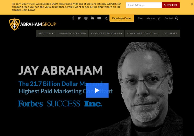
Jay Abraham, 2021/2023:
Jay is a true marketing legend. He has created $21.7 BILLION IN GROWTH for his client’s businesses as of 2021. Jay’s site from 2019 was only a tiny bit different. The logo was changed, the hero image of Jay has a bit of a transparent overlay now.
The page menu titles are a bit easier to read. (font changed)
He has a lot of social proof with Forbes, Inc, and Success magazines.
Plus, read that type at the top of the page. You do get value from his site.
The white-on-blue play button makes you want to click it.
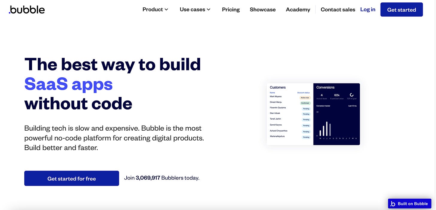
Every Above the Fold published recently (July, 2023):
The current aesthetic seems to be no “hero images”, just a headline, and a subheadline. The best sites will always have a CTA (call to action/click to action) button, and some social proof above the fold.
Do you prefer the new aesthetic or the hero image aesthetic?
More Samples: The Best Landing Pages
I hope you have learned about the power of ‘Above the Fold’.
This is part of my “Getting Deeper with Marketing” topic newsletter. You can see more here: https://pau1.substack.com/s/getting-deeper-into-marketing
Thank you to the new subscribers. Till next time. ✌


This is great, Paul. As a former journalist and editor in a previous life, I was more or less trained in these practices. I apply them now to "Quoth the Maven." Headline writing is an art, as is layout. Unfortunately, Substack's design tools and layouts are limited. Such is the nature of this beast ...
However I'll confirm ...
* Headlines are probably the most important part of publishing
* Using eye-catching artwork as the lead-in
* Subheads also help enormously to break up the body of your piece
* Like subheads, use photos and artwork to break up the body and enhance a point
* Pull quotes work great, too
* Better to break up body into shorter, more readable paragraphs. Write like it would appear in a newspaper
* Link key words that you think your audience may not know a lot about, or might be interested in further exploring.
Key: Avoid huge blocks of type. I've seen way too many Substack pieces that have 250-word paragraphs. Many readers use their phones. Reading long paragraphs is an instant turnoff
Good stuff. I have a growing collection of Paul Makko bookmarks. -- Jim
Thank you. Such a lot of great information to work through!